Blue Is a Hot Color: Why Blue Is Everywhere Right Now
Why is blue a hot color right now? The science of our attraction to blue, the psychology behind it, and how cobalt, navy and icy blue are dominating fashion, interiors and design.
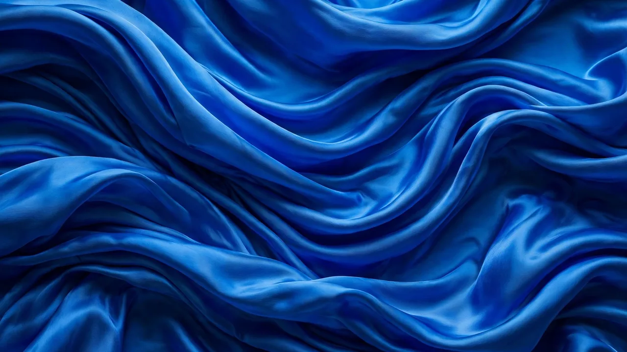
What Does “Blue Is a Hot Color” Actually Mean?
When people say blue is a hot color, they usually mean one of two things — and both are true right now. First, blue is trending: it is the shade dominating runways, street style, interiors, and brand design, the color everyone seems to be reaching for. Second, blue is literally showing up in its hottest, most vivid forms — electric cobalt, saturated royal blue, glowing cerulean — shades with an intensity that reads as bold and energetic rather than calm and quiet.
This guide explains both meanings. We will look at the science of why humans are so drawn to blue, the psychology that makes it feel trustworthy and calming, and the style forces — from fashion houses to interior designers — that have made blue the defining color of the moment. No hype, no invented statistics: just what is actually known about our oldest favorite color and its very modern moment.
In this article
- What Does “Blue Is a Hot Color” Actually Mean?
- The Psychology of Blue
- Key: Blue Shades and What They Signal
- Blue in Fashion: From Denim to the Runway
- Blue in Interior Design
- Blue in Branding and Digital Design
- How to Wear and Use Blue Right Now
- Blue in Design: Advantages and Drawbacks
- A Short History of Blue: The Color We Had to Invent
- Frequently Asked Questions
The Psychology of Blue
Color psychology — the study of how colors affect mood and behavior — consistently links blue with a specific cluster of feelings:
- Calm and stability: blue is widely associated with lowering perceived stress and creating a sense of order. It is the color of clear thinking in most Western associations.
- Trust and reliability: blue reads as honest and dependable, which is why it dominates corporate branding, banking, and healthcare design.
- Focus and productivity: studies of work environments often find blue associated with concentration and mental clarity, making it a favorite for offices and study spaces.
- Openness and depth: darker blues suggest seriousness and authority; lighter blues suggest friendliness and approachability.
A fair caveat: color meanings are not universal laws. Cross-cultural research shows real variation — in some cultures blue carries religious or mourning associations, and personal experience shapes individual responses. The calm-trust-focus cluster is the dominant pattern in Western psychology literature, not a rule every human follows. Still, it explains why blue keeps getting chosen when the stakes are high: job interviews, first dates, brand logos, hospital walls.
Key: Blue Shades and What They Signal
Cobalt blue: vivid, electric, high-energy. The “hot” blue of the moment — bold in fashion and art, impossible to ignore.
Navy blue: deep, authoritative, classic. The suit-and-uniform blue; signals seriousness and tradition.
Cerulean blue: bright sky blue. Open, optimistic, and fresh; a favorite in sportswear and casual design.
Ice blue: pale, desaturated, almost grey. Minimal, architectural, and cool — the defining blue of recent minimalist fashion.
Teal: blue-green crossover. Creative and modern; common in tech branding and contemporary interiors.
Powder blue: soft and gentle. Calming and nostalgic; popular in bedrooms and baby-nursery palettes.
Blue in Fashion: From Denim to the Runway
No color has fashion history like blue. Denim — indigo-dyed cotton twill — is arguably the most worn fabric on Earth, and blue jeans are the rare garment that crosses every class, age group, and subculture. When fashion writers say “blue is the new black,” they are pointing at this versatility: blue goes with everything, flatters most skin tones, and never quite goes out of style.
But blue is not just a safe neutral right now — it is a statement. Recent seasons have seen a clear pivot toward blue as a deliberate, visible choice:
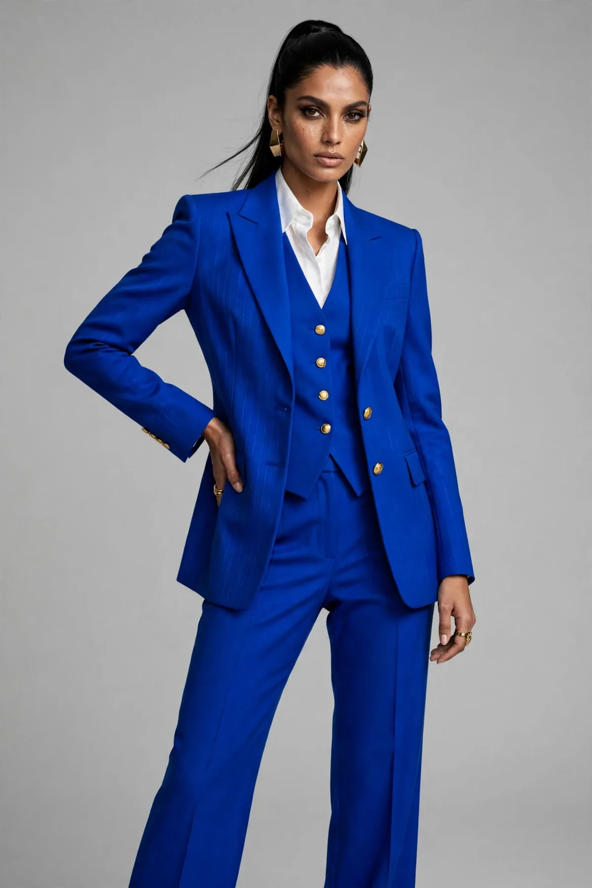
- Cobalt suiting and dresses: head-to-toe saturated blue on red carpets and runways, worn as a power color the way red used to be.
- Cool, icy blues: desaturated blue-grey tones in knitwear, tailoring, and sneakers — a minimal, architectural look that fashion forecasting picked up as early as 2024 and that has only grown.
- Head-to-toe denim: the Canadian tuxedo, rehabilitated — denim-on-denim in washed, dark, and raw finishes.
- Nautical navy: Breton stripes, anchors, and true navy cycling back as a transitional-season staple.
The psychology explains the appetite. After years of loud maximalism and then pandemic-era beige minimalism, blue offers something in between: color with composure. It lets people wear something vivid without wearing something chaotic.
Blue in Interior Design
Interiors are where blue’s “hot color” status is most visible to non-fashion people. Deep blue walls, blue velvet sofas, and blue kitchen cabinetry have moved from bold choice to mainstream default — and the reasons are practical as well as aesthetic.
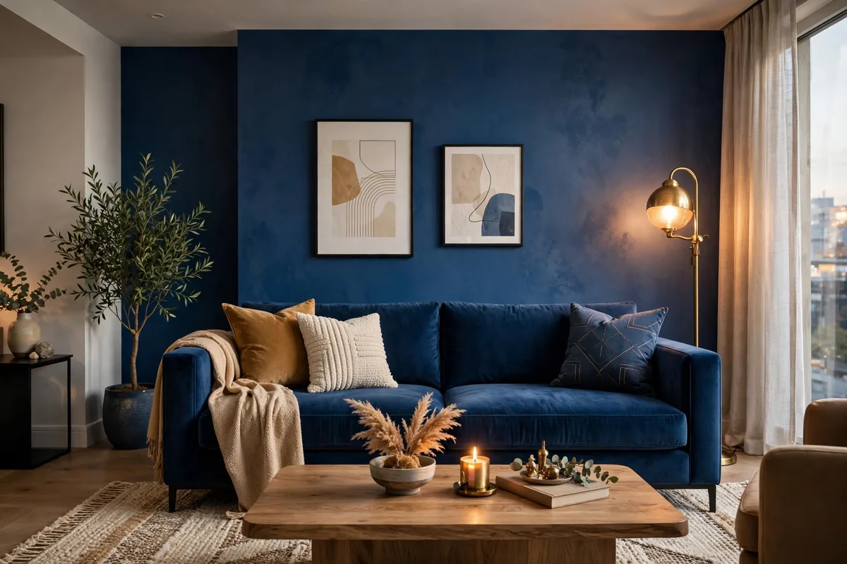
Blue rooms genuinely feel different. Cooler blues make spaces feel larger and calmer, which is why they dominate bedrooms and bathrooms. Deeper blues — navy, ink, midnight — create cocoon-like intimacy in living rooms and dining rooms, especially paired with warm lighting and brass or wood accents. Designers love blue because it plays well with both warm metals (gold, copper) and cool ones (chrome, nickel), and because it photographs beautifully.
The current interior moment favors drenched blue rooms — walls, trim, and even ceilings in one saturated shade — and blue as the anchor in otherwise neutral spaces: one navy sofa, one cobalt rug, one wall of blue tile. Both approaches use blue’s depth to give a room instant character without clutter.
Blue in Branding and Digital Design
Walk through any app store or high street and count the blue logos. Banks, airlines, tech platforms, and healthcare companies lean on blue for the same reason: it signals trust at a glance. When a company needs you to hand over money, data, or your health, blue is the color that says “you are safe here.”
Digital design has its own blue story. Interface blues — the familiar blues of links, buttons, and social platforms — became the default accent color of the web partly because blue is the color most people can distinguish most reliably, including many people with common forms of color blindness. It is functional, not just fashionable. Dark-mode design has pushed this further: electric blues glow beautifully against black backgrounds, which is one reason vivid blue gradients are everywhere in tech branding right now.
How to Wear and Use Blue Right Now
Whether you are updating a wardrobe or a living room, a few practical principles keep blue working for you instead of overwhelming the space:
- Pick your temperature: warm skin tones and warm rooms glow with cobalt and royal blue; cooler palettes suit ice blue and navy.
- One hero piece: a single saturated blue item — a blazer, a sofa, an accent wall — has more impact than blue scattered everywhere.
- Pair with intention: blue with white reads crisp and nautical; blue with camel or tan reads warm and expensive; blue with black reads dramatic and modern.
- Don’t fear dark blue walls: in small rooms, deep blue can feel enveloping rather than shrinking, especially with good lighting and a light ceiling.
- Test in your light: blue shifts dramatically between morning and evening light. Live with a swatch or wear the garment in daylight before committing.
Blue in Design: Advantages and Drawbacks
| Pros | Cons |
|---|---|
| Universally liked — the safest bold color choice | So popular it can feel generic if used without intention |
| Signals trust, calm, and competence | Can read as cold or corporate in the wrong shade |
| Dark blues show dust and pet hair in interiors | Vivid blues can overwhelm small spaces or petite frames |
| Flatters most skin tones in clothing | “Safe” blues (plain navy) can look uninspired without texture or contrast |
| Timeless — blue rarely looks dated | “Safe” blues (plain navy) can look uninspired without texture or contrast |
The current interior moment favors drenched blue rooms — walls, trim, and even ceilings in one saturated shade — and blue as the anchor in otherwise neutral spaces: one navy sofa, one cobalt rug, one wall of blue tile. Both approaches use blue’s depth to give a room instant character without clutter.
A Short History of Blue: The Color We Had to Invent
Part of blue’s mystique is that, for most of history, it was genuinely hard to make. The ancient Egyptians created one of the first synthetic pigments of any color — Egyptian blue — more than 4,000 years ago, using it in tombs and ornaments. But the most famous blue in art history is ultramarine, ground from the semi-precious stone lapis lazuli mined in what is now Afghanistan. In Renaissance Europe, ultramarine was so costly — sometimes priced above gold — that painters reserved it for the most sacred figures in a painting, typically the Virgin Mary’s robes.
Everything changed in 1826, when a synthetic version of ultramarine was developed in France, making vivid blue affordable for the first time. Around the same era, indigo dye was already coloring the working clothes that would become blue jeans. In the 20th century, artists kept pushing blue further — Yves Klein even patented his own deep shade, International Klein Blue, in 1960. Each era’s “hot blue” was really a technology story: new chemistry unlocking a bluer blue. Today’s cobalt-everywhere moment is the latest chapter — vivid blue is now cheap to produce in fabric, paint, and pixels, so there is nothing stopping it.
Frequently Asked Questions
Why is blue considered a hot color right now?
Blue is trending across fashion, interiors, and branding — from vivid cobalt to minimal ice blue — while also being the world’s most consistently popular favorite color. It offers color with composure: bold enough to feel current, calm enough to live with.
What does the color blue symbolize?
In Western color psychology, blue most commonly symbolizes calm, trust, stability, and focus. Darker blues add authority and seriousness; lighter blues add openness and friendliness. Meanings vary across cultures and individuals.
Is blue a warm or cool color?
Technically, blue is a cool color — it sits on the cool side of the color wheel opposite reds and oranges. But vivid, saturated blues like cobalt can feel energetic and “hot” in an emotional sense, which is part of why the phrase “blue is a hot color” caught on.
Why is blue everyone’s favorite color?
Researchers point to evolution: blue is the color of clear skies and clean water, and it almost never signals danger in nature the way red or yellow can. That deep association with safety and openness likely underlies its unmatched popularity in surveys worldwide.
What colors go well with blue?
Blue pairs with white for a crisp nautical look, with camel, tan, and gold for warmth, with grey for minimal sophistication, and with black for drama. Coral and orange — blue’s complements — create high-energy contrast.
Is blue good for a bedroom?
Yes — blue is one of the most recommended bedroom colors because of its calming associations. Softer blues (powder, ice, light cerulean) work best for restfulness; save deep navy for accent walls or bedding rather than all four walls if the room is small.
What is the most popular shade of blue in fashion now?
Two blues are leading: vivid cobalt, worn as a saturated statement, and desaturated ice blue, favored in minimalist tailoring and knitwear. Navy remains the perennial classic underneath both trends.
Does blue really affect your mood?
Research suggests it can, though the effects are modest and context-dependent. Exposure to blue environments is associated with lower self-reported stress and better concentration in several workplace and lab studies. But lighting, personal taste, and culture matter as much as hue — paint color alone will not fix a bad night’s sleep or a stressful job.
Read Also: Peyote (Complete Guide): Botany, History, Legal Status & Conservation
#blueisahotcolor #colorpsychology #designtrends #fashiontrends

Related Articles

Lucipara: Indonesia Banda Sea Islands Guide (2026)
Lucipara most often means the remote Lucipara Islands in Indonesia's Banda Sea, a small atoll group…

Carnauba Wax (2026 Guide): What It Is, Uses, Types, and How to Use It Safely
Carnauba wax is a natural plant wax known for its hard finish and high shine. This…
Quartz (2026 Guide): What This Common Mineral Is, Its Properties, Types & Uses
Everything you need to know about quartz - the silicon dioxide mineral behind glass, gemstones, and…
2 Comments